Why the new visual?
From day one, we have been inspired by nature, its power and purity. With our new visual style, we want to show this even more.
Our values, products and commitment to quality remain the same. We're just more in tune with what inspires us.


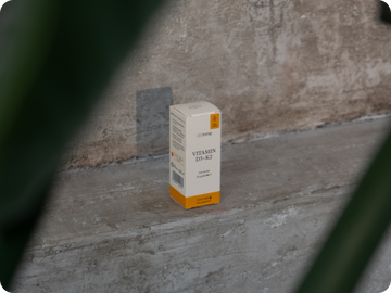
Pastel colours as the identity of each series


What has changed and what remains the same?

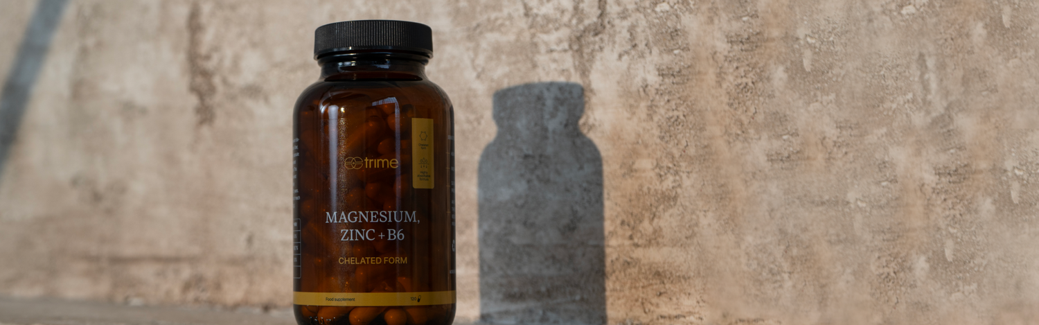
New design, same quality
The packaging of our products now better describes their content - pure ingredients inspired by nature. What colours make up our brand? Explore our new design with us. We'll tell you all the details.
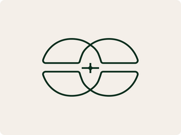
New logo
The symbol itself reflects both the element of DNA, the cornerstone of all life, and the symbolism of the plus sign or modified cross, which can be interpreted as a reference to health
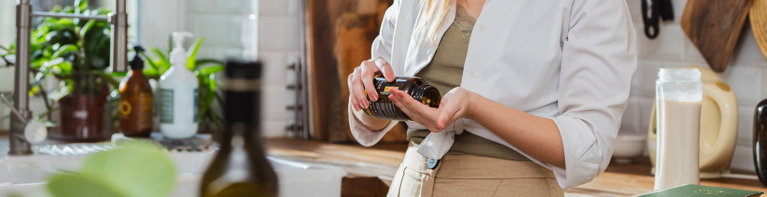

What you like about us, we don't change
We want our visual style to best reflect what defines us - respect for nature, a love of quality ingredients and a commitment to bringing you only the best. Rebranding is our way of showing it all at a glance.
- Quality and natural ingredients
- Transparency
- Products that are kind to you and to nature


